Cocoa Daisy Color Palette
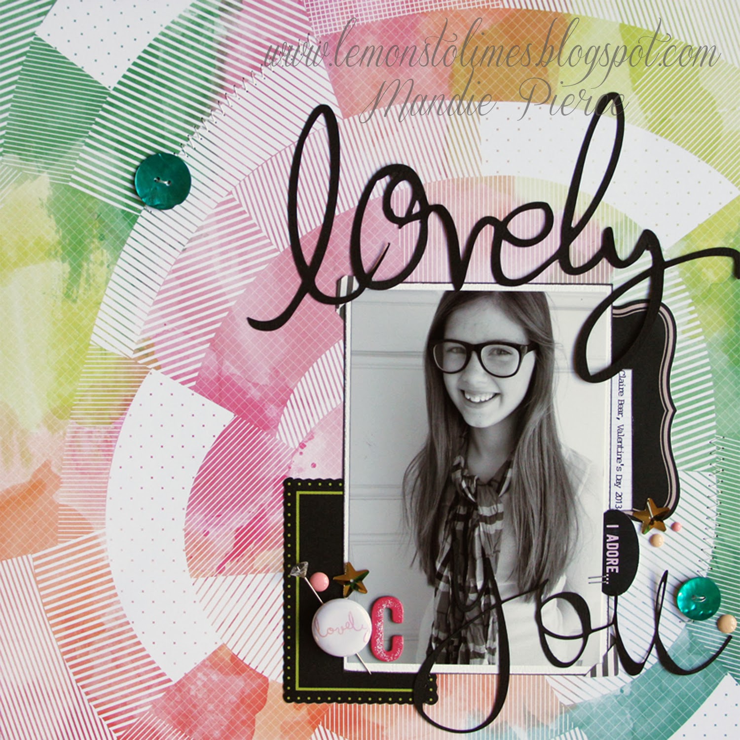
As, I said the other day, this kit is BEAUTIFUL! Here is what I did with kit. Pop on over to the gallery to see the rest of the design team's take on the kit. The kits are available now to subscribers and to non-subscribers on the first. Don't want to miss out on any of these gorgeous kits? Subscribe to a 6 month main kit or Day in the Life subscription and save 40% off the February kit with the discount code: NEWSUB40%OFF

(warning this post is VERY photo heavy!)
I just could not bear to cut down this gorgeous Basic Grey paper. So, I kept it fairly simple and layered on some pretties in the center of the circle.
I so love this photo of the boys. A completely everyday moment that I was so excited to capture. It just shows their relationship with each other. Sometimes they fight, but most often they are best friends.
Try as I may to fix the photo, this layout has a green tinge to it. I'm not sure why. The background is more cream in real life... I used a combo of papers on this layout. I love these old photos of my youngest and me from a couple of years ago. He is a snuggler and often finds his way into our room. He's so fiercely independent during the day, but not so much at night!
I wanted to make a more masculine layout with this feminine color dominated kit. This layout started with the Dear Lizzy triangle punches (I believe I used the larger one here.) They didn't quite fit together; so, I let it be and went with wonky! (the wooden buttons here are from my stash and not included in any of the kits)
I'm sure as parents, we can all relate to this. I worked in the toddler room at BSF a couple of weeks ago; and, as I sat there with the little guys, I felt like my kids' little years just slipped away. Did I make the most of that time with them? I think we all feel that way at some point or another. I just wanted to say it permanently to my kids.
This layout is purely for fun. I LOVE the colors in this kit. So vibrant and sherbet. I had attempted to use this awesome card from the Day in the Life kit with my Week 3 Project Life spread. It was just too busy with what I already had going on. (I am so NOT a PL planner, by the way. I just kinda make it as I go.) Anyway. It was perfect with this photo from Tropical Smoothie. I felt like these papers were too. I used the Whimsical Frame Stamp set from last month. (I can't believe this is still in stock! So cute & used it to make photo labels in my Project Life, as well.)
I thought the gold doily vellum paper from Pallette was a perfect fit for this photo of Troy and myself. I wanted to keep it simple; so I cut out a few of the doilies and layered them with a couple of little bits.


wow!! I really love all your layouts!! The colors are so amazing!
ReplyDelete