august scrap again!
today i am going to share my august layouts for scrap again. you will likely notice they all look similar. i started out by making this layout:
i loved this layout. but, i thought, "how can i provide inspiration for the ladies at the crop? many of them are 12x12, 2 page, multi photo scrappers." so, i "lifted" myself and made 2 more layouts to show how you could take the original 8.5x11 layout and make 12x12 layouts with more than one photo. so... let's get started.
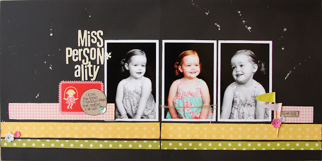
so, for this layout, i spread it out to 2 pages and added a couple of photos. you could even use up some of the white space & add another photo in there. i kept the photo strips and rearranged some of the embellishments.
for the last layout i went with a single 12x12 layout. i kept the strips again, but switched it up to more boy-ish product (the october afternoon rocket age collection). i move the journaling to the bottom and the title next to the photos.
lastly, i made a card. same principle with strips of pattern paper.
i hope this has encouraged you to look at layouts differently and see what you can use to inspire you!


I am really crazy about these bold colors I have been seeing from you! Those color and that design on black just rocks! Great design on all of it!
ReplyDeleteSo fun! I love the black as the background. I've tried to do that and it just never looks cool. Yours, however, looks amazing!!
ReplyDeleteLOVE that first layout, mandie! Oooooh!
ReplyDeleteAwesome! Love what you're doing with the black backgrounds.Great work!
ReplyDeleteLove how these are all similar but not. And you are so amazing with black cardstock!
ReplyDelete